

The Iptanus File Upload plugin can collect more than files. Alongside an upload, your visitors can fill in fields of their own, in any of these types:
- Simple Text
- Multiple Lines Text
- Number
- Confirmation Email
- Password
- Confirmation Password
- Checkbox
- Radio Button
- Date
- Time
- DateTime
- Listbox
- Dropdown
Each type carries its own set of options, described below. All of them are set through the userdatalabel attribute, or through the shortcode composer.
Simple text
The simplest field type: a single line of free text. To set the type by hand, add |t:text to the userdatalabel attribute.

The following options are supported:
| Shortcode Composer Option | Description | Shortcode Syntax |
|---|---|---|
| Label | This is the label of the text field, as “Your name” in the above example. | This is the first element of userdatalabel attribute, just make sure that the label does not contain any slash (/) or pipe (|) characters, because both are used as separators, e.g. userdatalabel=”Your name”. To define more than one field, separate them with a slash (/): userdatalabel=”Your name/Your surname” creates two text fields, labelled “Your name” and “Your surname”. |
| Label Position | Select the position of the label, in relation to the field. Available values are: none, top, right, bottom, left. If “none” is selected, then the label will not be shown. Default value is “left”. | |s:{label position}e.g. if you want the label “Your name” to be at the right side of the field, then you must set userdatalabel=”Your name|s:right” |
| Required | If activated, then the field will have to be filled before the user uploads a file. A “(required)” word will be appended to the label. If the user tries to upload a file but the field is empty, then upload will fail and a hint will appear next to the field notifying the user. | |r:{0 or 1}e.g. if you want the field with label “Your name” to be required, then you must set userdatalabel=”Your name|r:1″ |
| Do not autocomplete | If activated, then browsers will not be allowed to fill this field with auto-complete data. | |a:{0 or 1}e.g. if you want the field with label “Your name” not be filled with auto-complete data, then you must set userdatalabel=”Your name|a:1″ |
| Hint Position | Select the position of the hint that is shown next to the field to prompt the user that it is empty. Available values are: none, inline, top, right, bottom, left. | |h:{hint position}e.g. if you want the hint to be shown at the top of the field, then you must set userdatalabel=”Your name|h:top” |
| Default | Set a default value for the field | |d:{default value}e.g. if you want the field with label “Your name” to have a default value “nick”, then you must set userdatalabel=”Your name|d:nick” |
Multiple lines of text
A text field spanning several lines. To set the type by hand, add |t:multitext to the userdatalabel attribute.
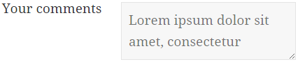
The following options are supported:
| Shortcode Composer Option | Description | Shortcode Syntax |
|---|---|---|
| Label | This is the label of the text field, as “Your comments” in the above example. | This is the first element of userdatalabel attribute, just make sure that the label does not contain any slash (/) or pipe (|) characters, because these are used as separators, e.g. userdatalabel=”Your comments”. To define additional fields, separate them with a slash (/), e.g. userdatalabel=”Your name/Your comments|t:multitext” will create two fields, one text field with label “Your name” and one multi-line text with label “Your comments”. |
| Label Position | Select the position of the label, in relation to the field. Available values are: none, top, right, bottom, left. If “none” is selected, then the label will not be shown. Default value is “left”. | |s:{label position}e.g. if you want the label “Your name” to be at the right side of the field, then you must set userdatalabel=”Your name|s:right” |
| Required | If activated, then the field will have to be filled before the user uploads a file. A “(required)” word will be appended to the label. If the user tries to upload a file but the field is empty, then upload will fail and a hint will appear next to the field notifying the user. | |r:{0 or 1}e.g. if you want the field with label “Your comments” to be required, then you must set userdatalabel=”Your comments|r:1″ |
| Hint Position | Select the position of the hint that is shown next to the field to prompt the user that it is empty. Available values are: none, inline, top, right, bottom, left. | |h:{hint position}e.g. if you want the hint to be shown at the top of the field, then you must set userdatalabel=”Your comments|h:top” |
Number
A field for whole or decimal numbers, with a full stop as the decimal separator. To set the type by hand, add |t:number to the userdatalabel attribute.

The following options are supported:
| Shortcode Composer Option | Description | Shortcode Syntax |
|---|---|---|
| Label | This is the label of the number field, as “Give a value” in the above example. | This is the first element of userdatalabel attribute, just make sure that the label does not contain any slash (/) or pipe (|) characters, because these are used as separators, e.g. userdatalabel=”Give a value”. To define additional fields, separate them with a slash (/), e.g. userdatalabel=”Your name/Give a value|t:number” will create two fields, one text field with label “Your name” and one number field with label “Give a value”. |
| Label Position | Select the position of the label, in relation to the field. Available values are: none, top, right, bottom, left. If “none” is selected, then the label will not be shown. Default value is “left”. | |s:{label position}e.g. if you want the label “Give a value” to be at the right side of the field, then you must set userdatalabel=”Give a value|s:right” |
| Required | If activated, then the field will have to be filled before the user uploads a file. A “(required)” word will be appended to the label. If the user tries to upload a file but the field is empty, then upload will fail and a hint will appear next to the field notifying the user. | |r:{0 or 1}e.g. if you want the field with label “Give a value” to be required, then you must set userdatalabel=”Give a value|r:1″ |
| Do not autocomplete | If activated, then browsers will not be allowed to fill this field with auto-complete data. | |a:{0 or 1}e.g. if you want the field with label “Give a value” not be filled with auto-complete data, then you must set userdatalabel=”Give a value|a:1″ |
| Validate | If activated, then the field value will be checked if it is a valid number before file upload. If it is not a valid number, then a hint will appear next to the field notifying the user. | |v:{0 or 1}e.g. if you want the field with label “Give a value” to be validated, then you must set userdatalabel=”Give a value|v:1″ |
| Hint Position | Select the position of the hint that is shown next to the field to prompt the user that it is empty or not validated. Available values are: none, inline, top, right, bottom, left. | |h:{hint position}e.g. if you want the hint to be shown at the top of the field, then you must set userdatalabel=”Give a value|h:top” |
| Default | Set a default value for the field | |d:{default value}e.g. if you want the field with label “Give a value” to have the default value “1.0”, then you must set userdatalabel=”Give a value|d:1.0″ |
| Format | Set the format of the field. It accepts the following values:
|
|f:{d or f}e.g. if you want the field with label “Give a value” to accept a floating point number, then you must set userdatalabel=”Give a value|f:f” |
A field for an email address. To set the type by hand, add |t:email to the userdatalabel attribute.

The following options are supported:
| Shortcode Composer Option | Description | Shortcode Syntax |
|---|---|---|
| Label | This is the label of the email field, as “Your email” in the above example. | This is the first element of userdatalabel attribute, just make sure that the label does not contain any slash (/) or pipe (|) characters, because these are used as separators, e.g. userdatalabel=”Your email”. To define additional fields, separate them with a slash (/), e.g. userdatalabel=”Your name/Your email|t:email” will create two fields, one text field with label “Your name” and one email field with label “Your email”. |
| Label Position | Select the position of the label, in relation to the field. Available values are: none, top, right, bottom, left. If “none” is selected, then the label will not be shown. Default value is “left”. | |s:{label position}e.g. if you want the label “Your email” to be at the right side of the field, then you must set userdatalabel=”Your email|s:right” |
| Required | If activated, then the field will have to be filled before the user uploads a file. A “(required)” word will be appended to the label. If the user tries to upload a file but the field is empty, then upload will fail and a hint will appear next to the field notifying the user. | |r:{0 or 1}e.g. if you want the field with label “Your email” to be required, then you must set userdatalabel=”Your email|r:1″ |
| Do not autocomplete | If activated, then browsers will not be allowed to fill this field with auto-complete data. | |a:{0 or 1}e.g. if you want the field with label “Your email” not be filled with auto-complete data, then you must set userdatalabel=”Your email|a:1″ |
| Validate | If activated, then the field value will be checked if it is a valid email address before file upload. If it is not a valid email, then a hint will appear next to the field notifying the user. | |v:{0 or 1}e.g. if you want the field with label “Your email” to be validated, then you must set userdatalabel=”Your email|v:1″ |
| Hint Position | Select the position of the hint that is shown next to the field to prompt the user that it is empty or not validated. Available values are: none, inline, top, right, bottom, left. | |h:{hint position}e.g. if you want the hint to be shown at the top of the field, then you must set userdatalabel=”Your email|h:top” |
| Default | Set a default email address for the field | |d:{default value}e.g. if you want the field with label “Your email” to have the default value “myname@domain.com”, then you must set userdatalabel=”Your email|d:myname@domain.com” |
| Group ID | If a non-empty value is set, then this field will act as a base email address for another email confirmation field having the same group ID. | |g:{group id}e.g. if you want the field with label “Your email” to have a group ID value of 1, then you must set userdatalabel=”Your email|g:1″ |
Confirmation email
A second email field, which must match the Email field carrying the same Group ID. To set the type by hand, add |t:confirmemail to the userdatalabel attribute.

The following options are supported:
| Shortcode Composer Option | Description | Shortcode Syntax |
|---|---|---|
| Label | This is the label of the email confirmation field, as “Confirm email” in the above example. | This is the first element of userdatalabel attribute, just make sure that the label does not contain any slash (/) or pipe (|) characters, because these are used as separators, e.g. userdatalabel=”Confirm email”. To define additional fields, separate them with a slash (/), e.g. userdatalabel=”Your email|t:email|g:1/Confirm email|t:confirmemail|g:1″ will create two fields, one email field with label “Your email” and one email confirmation field with label “Confirm email” grouped together. |
| Label Position | Select the position of the label, in relation to the field. Available values are: none, top, right, bottom, left. If “none” is selected, then the label will not be shown. Default value is “left”. | |s:{label position}e.g. if you want the label “Confirm email” to be at the right side of the field, then you must set userdatalabel=”Confirm email|s:right” |
| Required | If activated, then the field will have to be filled before the user uploads a file. A “(required)” word will be appended to the label. If the user tries to upload a file but the field is empty, then upload will fail and a hint will appear next to the field notifying the user. | |r:{0 or 1}e.g. if you want the field with label “Confirm email” to be required, then you must set userdatalabel=”Confirm email|r:1″ |
| Do not autocomplete | If activated, then browsers will not be allowed to fill this field with auto-complete data. | |a:{0 or 1}e.g. if you want the field with label “Confirm email” not be filled with auto-complete data, then you must set userdatalabel=”Confirm email|a:1″ |
| Hint Position | Select the position of the hint that is shown next to the field to prompt the user that it is empty or not matching the base email. Available values are: none, inline, top, right, bottom, left. | |h:{hint position}e.g. if you want the hint to be shown at the top of the field, then you must set userdatalabel=”Confirm email|h:top” |
| Group ID | Set an non-empty value matching the Group ID of another Email field, so that it can act as a confirmation email. | |g:{group id}e.g. if you want the field with label “Confirm email” to have a group ID value of 1, then you must set userdatalabel=”Confirm email|g:1″ |
Password
A single-line field for a password. What is typed is hidden behind bullet characters (•). To set the type by hand, add |t:password to the userdatalabel attribute.

The following options are supported:
| Shortcode Composer Option | Description | Shortcode Syntax |
|---|---|---|
| Label | This is the label of the password field, as “Enter password” in the above example. | This is the first element of userdatalabel attribute, just make sure that the label does not contain any slash (/) or pipe (|) characters, because these are used as separators, e.g. userdatalabel=”Enter password”. To define additional fields, separate them with a slash (/), e.g. userdatalabel=”Your name/Enter password|t:password” will create two fields, one text field with label “Your name” and one password field with label “Enter password”. |
| Label Position | Select the position of the label, in relation to the field. Available values are: none, top, right, bottom, left. If “none” is selected, then the label will not be shown. Default value is “left”. | |s:{label position}e.g. if you want the label “Enter password” to be at the right side of the field, then you must set userdatalabel=”Enter password|s:right” |
| Required | If activated, then the field will have to be filled before the user uploads a file. A “(required)” word will be appended to the label. If the user tries to upload a file but the field is empty, then upload will fail and a hint will appear next to the field notifying the user. | |r:{0 or 1}e.g. if you want the field with label “Enter password” to be required, then you must set userdatalabel=”Enter password|r:1″ |
| Hint Position | Select the position of the hint that is shown next to the field to prompt the user that it is empty. Available values are: none, inline, top, right, bottom, left. | |h:{hint position}e.g. if you want the hint to be shown at the top of the field, then you must set userdatalabel=”Enter password|h:top” |
| Group ID | If a non-empty value is set, then this field will act as a base password field for another password confirmation field having the same group ID. | |g:{group id}e.g. if you want the field with label “Enter password” to have a group ID value of 1, then you must set userdatalabel=”Enter password|g:1″ |
Confirmation password
A second password field, which must match the Password field carrying the same Group ID. What is typed is hidden behind bullet characters (•). To set the type by hand, add |t:confirmpassword to the userdatalabel attribute.

The following options are supported:
| Shortcode Composer Option | Description | Shortcode Syntax |
|---|---|---|
| Label | This is the label of the password confirmation field, as “Confirm password” in the above example. | This is the first element of userdatalabel attribute, just make sure that the label does not contain any slash (/) or pipe (|) characters, because these are used as separators, e.g. userdatalabel=”Confirm password”. To define additional fields, separate them with a slash (/), e.g. userdatalabel=”Enter password|t:password|g:1/Confirm password|t:confirmpassword|g:1″ will create two fields, one password field with label “Enter password” and one password confirmation field with label “Confirm password” grouped together. |
| Label Position | Select the position of the label, in relation to the field. Available values are: none, top, right, bottom, left. If “none” is selected, then the label will not be shown. Default value is “left”. | |s:{label position}e.g. if you want the label “Confirm password” to be at the right side of the field, then you must set userdatalabel=”Confirm password|s:right” |
| Required | If activated, then the field will have to be filled before the user uploads a file. A “(required)” word will be appended to the label. If the user tries to upload a file but the field is empty, then upload will fail and a hint will appear next to the field notifying the user. | |r:{0 or 1}e.g. if you want the field with label “Confirm password” to be required, then you must set userdatalabel=”Confirm password|r:1″ |
| Hint Position | Select the position of the hint that is shown next to the field to prompt the user that it is empty or not matching the base password. Available values are: none, inline, top, right, bottom, left. | |h:{hint position}e.g. if you want the hint to be shown at the top of the field, then you must set userdatalabel=”Confirm password|h:top” |
| Group ID | Set an non-empty value matching the Group ID of another Password field, so that it can act as a confirmation password. | |g:{group id}e.g. if you want the field with label “Confirm password” to have a group ID value of 1, then you must set userdatalabel=”Confirm password|g:1″ |
Checkbox
A box the visitor ticks to agree to a statement, or leaves clear. To set the type by hand, add |t:checkbox to the userdatalabel attribute.

The following options are supported:
| Shortcode Composer Option | Description | Shortcode Syntax |
|---|---|---|
| Label | This is the label of the checkbox field. In the above screenshot example, the label is not shown because its position has been set to “none”, however the label is useful to identify the field when using it as a variable for other shortcode attributes using the Shortcode Composer. | This is the first element of userdatalabel attribute, just make sure that the label does not contain any slash (/) or pipe (|) characters, because these are used as separators, e.g. userdatalabel=”Confirm license”. To define additional fields, separate them with a slash (/), e.g. userdatalabel=”Enter name/Confirm license|t:checkbox|s:none|l:Check the box to accept the license agreement|f:right” will create two fields, one text field with label “Enter name” and one checkbox field with label “Confirm license” (not shown) and description “Check the box to accept the license agreement” positioned at the right side of the check-box. |
| Label Position | Select the position of the label, in relation to the field. Available values are: none, top, right, bottom, left. If “none” is selected, then the label will not be shown. Default value is “none”. | |s:{label position}e.g. if you want the label “Confirm license” to be at the right side of the field, then you must set userdatalabel=”Confirm license|s:right” |
| Required | If activated, then the field will have to be checked before the user uploads a file. A “(required)” word will be appended to the label (if the label is visible). If the user tries to upload a file but the field is not checked, then upload will fail and a hint will appear next to the field notifying the user. | |r:{0 or 1}e.g. if you want the field with label “Confirm license” to be required, then you must set userdatalabel=”Confirm license|r:1″ |
| Do not autocomplete | If activated, then browsers will not be allowed to fill this field with auto-complete data. | |a:{0 or 1}e.g. if you want the field with label “Confirm license” not be filled with auto-complete data, then you must set userdatalabel=”Confirm license|a:1″ |
| Hint Position | Select the position of the hint that is shown next to the field to prompt the user that it is not checked. Available values are: none, inline, top, right, bottom, left. | |h:{hint position}e.g. if you want the hint to be shown at the top of the field, then you must set userdatalabel=”Confirm license|h:top” |
| Default | Set a default value for the field (true for checked, false or nothing for unchecked). | |d:{true or false}e.g. if you want the field with label “Confirm license” to be checked by default, then you must set userdatalabel=”Confirm license|d:true” |
| Description | Set a description (statement) that will be shown next to the check-box, to explain what this check-box is for. This can be a long text (e.g. acceptance of a license agreement), such as “Check the box to accept the license agreement” as the above screenshot example. | |l:{description}e.g. if you want the field with label “Confirm license” to have a description “Check the box to accept the license agreement”, then you must set userdatalabel=”Confirm license|l:Check the box to accept the license agreement” |
| Format | Set the position of the description in relation to the check-box. Acceptable values are: top, right, bottom, left. | |f:{format}e.g. if you want the field with label “Confirm password” and description “Check the box to accept the license agreement” to position the description at the right of check-box, then you must set userdatalabel=”Confirm license|l:Check the box to accept the license agreement|f:right” |
Radio button
A list of choices shown as radio buttons, of which the visitor picks one. To set the type by hand, add |t:radiobutton to the userdatalabel attribute.

The following options are supported:
| Shortcode Composer Option | Description | Shortcode Syntax |
|---|---|---|
| Label | This is the label of the radio-button field, as “Select color” in the above example. | This is the first element of userdatalabel attribute, just make sure that the label does not contain any slash (/) or pipe (|) characters, because these are used as separators, e.g. userdatalabel=”Select color”. To define additional fields, separate them with a slash (/), e.g. userdatalabel=”Enter name/Select color|t:radiobutton|l:red,green,blue,black” will create two fields, one text field with label “Enter name” and one radio-button field with label “Select color” and a list of radio buttons with labels red, green, blue, black as the above screenshot example. |
| Label Position | Select the position of the label, in relation to the field. Available values are: none, top, right, bottom, left. If “none” is selected, then the label will not be shown. Default value is “left”. | |s:{label position}e.g. if you want the label “Select color” to be at the right side of the field, then you must set userdatalabel=”Select color|s:right” |
| Required | If activated, then a radio button will have to be selected before the user uploads a file. A “(required)” word will be appended to the label (if the label is visible). If the user tries to upload a file but no selection has been made, then upload will fail and a hint will appear next to the field notifying the user. | |r:{0 or 1}e.g. if you want the field with label “Select color” to be required, then you must set userdatalabel=”Select color|r:1″ |
| Do not autocomplete | If activated, then browsers will not be allowed to fill this field with auto-complete data. | |a:{0 or 1}e.g. if you want the field with label “Select color” not be filled with auto-complete data, then you must set userdatalabel=”Select color|a:1″ |
| Hint Position | Select the position of the hint that is shown next to the field to prompt the user that no selection has been made. Available values are: none, inline, top, right, bottom, left. | |h:{hint position}e.g. if you want the hint to be shown at the top of the field, then you must set userdatalabel=”Select color|h:top” |
| Default | Set a default value for the field (that matches a value in the list of radio button items) or nothing. | |d:{default value}e.g. if you want the radio button “green” of the field with label “Select color” to be pre-selected, then you must set userdatalabel=”Select color|d:green” |
| Items | Sets a comma-separated list of radio buttons that will be shown. | |l:{items list}e.g. if you want the field with label “Select color” to have radio buttons with values “red”, “green”, “blue” and “black”, then you must set userdatalabel=”Select color|l:red,green,blue,black” |
| Group ID | If a non-empty value is set, then it will be grouped with other radio-button fields having the same Group ID. Grouped radio buttons can have only one radio button selected at a time. | |g:{group id}e.g. if you want the field with label “Select color” to have a group ID value of 1, then you must set userdatalabel=”Select color|g:1″ |
| Format | Set the position of the radio-button values in relation to the radio buttons. Acceptable values are: top, right, bottom, left.In addition, set the placement of the radio buttons. Acceptable values are horizontal and vertical. | |f:{format}e.g. if you want the radio values of the field with label “Select color” to be at the right side of the radio buttons and the radio buttons to be placed one below the other, then you must set userdatalabel=”Select color|f:right-vertical” |
Date
A date field. Clicking it opens a calendar to pick from, as shown below. To set the type by hand, add |t:date to the userdatalabel attribute.
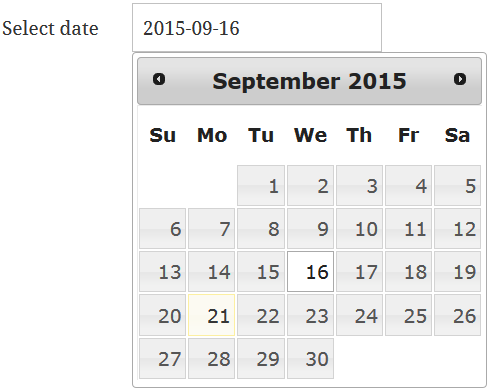
The following options are supported:
| Shortcode Composer Option | Description | Shortcode Syntax |
|---|---|---|
| Label | This is the label of the date field, as “Select date” in the above example. | This is the first element of userdatalabel attribute, just make sure that the label does not contain any slash (/) or pipe (|) characters, because these are used as separators, e.g. userdatalabel=”Select date”. To define additional fields, separate them with a slash (/), e.g. userdatalabel=”Enter name/Select date|t:date” will create two fields, one text field with label “Enter name” and one date field with label “Select date”. |
| Label Position | Select the position of the label, in relation to the field. Available values are: none, top, right, bottom, left. If “none” is selected, then the label will not be shown. Default value is “left”. | |s:{label position}e.g. if you want the label “Select date” to be at the right side of the field, then you must set userdatalabel=”Select date|s:right” |
| Required | If activated, then a date will have to be selected before the user uploads a file. A “(required)” word will be appended to the label (if the label is visible). If the user tries to upload a file but no selection has been made, then upload will fail and a hint will appear next to the field notifying the user. | |r:{0 or 1}e.g. if you want the field with label “Select date” to be required, then you must set userdatalabel=”Select date|r:1″ |
| Do not autocomplete | If activated, then browsers will not be allowed to fill this field with auto-complete data. | |a:{0 or 1}e.g. if you want the field with label “Select date” not be filled with auto-complete data, then you must set userdatalabel=”Select date|a:1″ |
| Hint Position | Select the position of the hint that is shown next to the field to prompt the user that it is empty. Available values are: none, inline, top, right, bottom, left. | |h:{hint position}e.g. if you want the hint to be shown at the top of the field, then you must set userdatalabel=”Select date|h:top” |
| Default | Set a default date for the field. Note that the date must have the format of the date field. The default value must be enclosed in parenthesis. | |d:(default date)e.g. if you want the field with label “Select date” to have a default date of “2015-09-16”, then you must set userdatalabel=”Select date|d:(2015-09-16)” |
| Format | Set the date format. The format must be enclosed in parenthesis. The default format is “(yy-mm-dd)”. Available options are:
|
|f:(format)e.g. if you want the format of the field with label “Select date” to be “dd/mm/yy”, then you must set userdatalabel=”Select date|f:(dd/mm/yy)” |
Time
A time field. Clicking it opens a set of sliders, as shown below. To set the type by hand, add |t:time to the userdatalabel attribute.

The following options are supported:
| Shortcode Composer Option | Description | Shortcode Syntax |
|---|---|---|
| Label | This is the label of the time field, as “Select time” in the above example. | This is the first element of userdatalabel attribute, just make sure that the label does not contain any slash (/) or pipe (|) characters, because these are used as separators, e.g. userdatalabel=”Select time”. To define additional fields, separate them with a slash (/), e.g. userdatalabel=”Enter name/Select time|t:time” will create two fields, one text field with label “Enter name” and one time field with label “Select time”. |
| Label Position | Select the position of the label, in relation to the field. Available values are: none, top, right, bottom, left. If “none” is selected, then the label will not be shown. Default value is “left”. | |s:{label position}e.g. if you want the label “Select time” to be at the right side of the field, then you must set userdatalabel=”Select time|s:right” |
| Required | If activated, then a time will have to be selected before the user uploads a file. A “(required)” word will be appended to the label (if the label is visible). If the user tries to upload a file but no selection has been made, then upload will fail and a hint will appear next to the field notifying the user. | |r:{0 or 1}e.g. if you want the field with label “Select time” to be required, then you must set userdatalabel=”Select time|r:1″ |
| Do not autocomplete | If activated, then browsers will not be allowed to fill this field with auto-complete data. | |a:{0 or 1}e.g. if you want the field with label “Select time” not be filled with auto-complete data, then you must set userdatalabel=”Select time|a:1″ |
| Hint Position | Select the position of the hint that is shown next to the field to prompt the user that it is empty. Available values are: none, inline, top, right, bottom, left. | |h:{hint position}e.g. if you want the hint to be shown at the top of the field, then you must set userdatalabel=”Select time|h:top” |
| Default | Set a default time for the field. Note that the time must have the format of the time field. The default value must be enclosed in parenthesis. | |d:(default time)e.g. if you want the field with label “Select time” to have a default time of “08:00”, then you must set userdatalabel=”Select time|d:(08:00)” |
| Format | Set the time format. The format must be enclosed in parenthesis. The default format is “(HH:mm)”. Available options are:
|
|f:(format)e.g. if you want the format of the field with label “Select time” to be “hh:mm.ss”, then you must set userdatalabel=”Select time|f:time(hh:mm.ss)” |
Date and time
A combined date and time field. Clicking it opens a calendar and a set of sliders together, as shown below. To set the type by hand, add |t:datetime to the userdatalabel attribute.

The following options are supported:
| Shortcode Composer Option | Description | Shortcode Syntax |
|---|---|---|
| Label | This is the label of the date/time field, as “Select date-time” in the above example. | This is the first element of userdatalabel attribute, just make sure that the label does not contain any slash (/) or pipe (|) characters, because these are used as separators, e.g. userdatalabel=”Select date-time”. To define additional fields, separate them with a slash (/), e.g. userdatalabel=”Enter name/Select date-time|t:datetime” will create two fields, one text field with label “Enter name” and one date/time field with label “Select date-time”. |
| Label Position | Select the position of the label, in relation to the field. Available values are: none, top, right, bottom, left. If “none” is selected, then the label will not be shown. Default value is “left”. | |s:{label position}e.g. if you want the label “Select date-time” to be at the right side of the field, then you must set userdatalabel=”Select date-time|s:right” |
| Required | If activated, then a date/time will have to be selected before the user uploads a file. A “(required)” word will be appended to the label (if the label is visible). If the user tries to upload a file but no selection has been made, then upload will fail and a hint will appear next to the field notifying the user. | |r:{0 or 1}e.g. if you want the field with label “Select date-time” to be required, then you must set userdatalabel=”Select date-time|r:1″ |
| Do not autocomplete | If activated, then browsers will not be allowed to fill this field with auto-complete data. | |a:{0 or 1}e.g. if you want the field with label “Select date-time” not be filled with auto-complete data, then you must set userdatalabel=”Select date-time|a:1″ |
| Hint Position | Select the position of the hint that is shown next to the field to prompt the user that it is empty. Available values are: none, inline, top, right, bottom, left. | |h:{hint position}e.g. if you want the hint to be shown at the top of the field, then you must set userdatalabel=”Select date-time|h:top” |
| Default | Set a default date and time for the field. Note that the date and time must have the format of the date/time field. The default value must be enclosed in parenthesis. | |d:(default date)e.g. if you want the field with label “Select date-time” to have a default date/time of “2015-08-23 08:00”, then you must set userdatalabel=”Select date-time|d:(2015-08-23 08:00)” |
| Format | Set the date/time format. The format is of the form date(date format) time (time format). For more information about how to format the date and time, check the format option of the aforementioned Date and Time fields. | |f:date(date format) time(time format)e.g. if you want the format of the field with label “Select date-time” to be “dd/mm/yy hh:mm.ss”, then you must set userdatalabel=”Select date-time|f:date(dd/mm/yy) time(hh:mm.ss)” |
List box
A list the visitor selects a value from. To set the type by hand, add |t:listbox to the userdatalabel attribute.
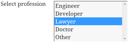
The following options are supported:
| Shortcode Composer Option | Description | Shortcode Syntax |
|---|---|---|
| Label | This is the label of the listbox field, as “Select profession” in the above example. | This is the first element of userdatalabel attribute, just make sure that the label does not contain any slash (/) or pipe (|) characters, because these are used as separators, e.g. userdatalabel=”Select profession”. To define additional fields, separate them with a slash (/), e.g. userdatalabel=”Enter name/Select profession|t:listbox” will create two fields, one text field with label “Enter name” and one listbox field with label “Select profession”. |
| Label Position | Select the position of the label, in relation to the field. Available values are: none, top, right, bottom, left. If “none” is selected, then the label will not be shown. Default value is “left”. | |s:{label position}e.g. if you want the label “Select profession” to be at the right side of the field, then you must set userdatalabel=”Select profession|s:right” |
| Required | If activated, then a value will have to be selected before the user uploads a file. A “(required)” word will be appended to the label (if the label is visible). If the user tries to upload a file but no selection has been made, then upload will fail and a hint will appear next to the field notifying the user. | |r:{0 or 1}e.g. if you want the field with label “Select profession” to be required, then you must set userdatalabel=”Select profession|r:1″ |
| Do not autocomplete | If activated, then browsers will not be allowed to fill this field with auto-complete data. | |a:{0 or 1}e.g. if you want the field with label “Select profession” not be filled with auto-complete data, then you must set userdatalabel=”Select profession|a:1″ |
| Hint Position | Select the position of the hint that is shown next to the field to prompt the user that it is empty. Available values are: none, inline, top, right, bottom, left. | |h:{hint position}e.g. if you want the hint to be shown at the top of the field, then you must set userdatalabel=”Select profession|h:top” |
| Default | Set a default value for the field (that matches a value in the list of items) or nothing. | |d:{default value}e.g. if you want the field with label “Select profession” to have a default of “Doctor”, then you must set userdatalabel=”Select profession|d:Doctor” |
| List Items |
Set a comma-separated list of item to be shown in the listbox. | |l:{list of items}e.g. if you want the listbox with label “Select profession” to have the items “Engineer”, “Developer” and “Other”, then you must set userdatalabel=”Select profession|l:Engineer,Developer,Other” |
Drop-down
A drop-down list the visitor selects a value from. To set the type by hand, add |t:dropdown to the userdatalabel attribute.

The following options are supported:
| Shortcode Composer Option | Description | Shortcode Syntax |
|---|---|---|
| Label | This is the label of the dropdown field, as “Select Destination” in the above example. | This is the first element of userdatalabel attribute, just make sure that the label does not contain any slash (/) or pipe (|) characters, because these are used as separators, e.g. userdatalabel=”Select Destination”. To define additional fields, separate them with a slash (/), e.g. userdatalabel=”Enter name/Select Destination|t:dropdown” will create two fields, one text field with label “Enter name” and one dropdown field with label “Select Destination”. |
| Label Position | Select the position of the label, in relation to the field. Available values are: none, top, right, bottom, left. If “none” is selected, then the label will not be shown. Default value is “left”. | |s:{label position}e.g. if you want the label “Select Destination” to be at the right side of the field, then you must set userdatalabel=”Select Destination|s:right” |
| Required | If activated, then a value will have to be selected before the user uploads a file. A “(required)” word will be appended to the label (if the label is visible). If the user tries to upload a file but no selection has been made, then upload will fail and a hint will appear next to the field notifying the user. | |r:{0 or 1}e.g. if you want the field with label “Select Destination” to be required, then you must set userdatalabel=”Select Destination|r:1″ |
| Do not autocomplete | If activated, then browsers will not be allowed to fill this field with auto-complete data. | |a:{0 or 1}e.g. if you want the field with label “Select Destination” not be filled with auto-complete data, then you must set userdatalabel=”Select Destination|a:1″ |
| Hint Position | Select the position of the hint that is shown next to the field to prompt the user that it is empty. Available values are: none, inline, top, right, bottom, left. | |h:{hint position}e.g. if you want the hint to be shown at the top of the field, then you must set userdatalabel=”Select Destination|h:top” |
| Default | Set a default value for the field (that matches a value in the list of items) or nothing. | |d:{default value}e.g. if you want the field with label “Select Destination” to have a default of “London”, then you must set userdatalabel=”Select Destination|d:London” |
| List Items |
Set a comma-separated list of the items to be shown in the drop-down list. | |l:{list of items}e.g. if you want the drop-down list with label “Select Destination” to have the items “New York”, “London” and “Tokyo”, then you must set userdatalabel=”Select Destination|l:New York,London,Tokyo” |
If you have questions or need more information, please contact us.
The Iptanus team
4 questions:
– How do I move the user data fields to above the file upload fields?
– How do I change `(required)` text to `*` or another language text?
– How do I change the `File %filename% is being uploaded` message? Setting waitmessage value in shortcode doesn’t seem to be working, though other things such as successmessage seem to work.
– How do I add watermark/placeholder text to simple text field?
Hi, here are answers:
1. Open the shortcode composer and go to Placements tab, where you can change the relative positioning of the plugin’s elements.
2. In the shortcode composer, in Labels tab there is an option for this.
3. This message will not show up during upload, but “Upload in progress” message. Do you want to change this message?
4. If you set label position of the text field to be ‘inside’, then label will become a placeholder of the text field.
Regards
Nickolas
I have 2 questions:
1) I would like to change the width of the title field in my form. When I put widths=”title:110px” into my shortcode (see shortcode below) it doesn’t change anything. I don’t know whether this has something to do with the fact that title, filename, and selectbutton are all on the same line. Basically, what I want to do is to make all of the form fields line up. Right now, all of the userdata form fields line up at 110px, but the filename field does not have the correct spacing. Can you help me with a solution?
2) All of the userdata field labels show up as bold, but the title (upload files) is not bold. Is there a way to either make all of the userdata field labels plain text or to make the title bold also? I’d like everything in my form to look uniform.
Thank you.
Michelle
[wordpress_file_upload fitmode=”responsive” maxsize=900 uploaduser=’all’ placements=userdata/title+filename+selectbutton/userdata/uploadbutton/captcha/filelist/progressbar/message notify=”true” notifyrecipients=”%useremail%” notifymessage=”Dear %username%,%n%%n% This is an automatic delivery message to notify you that a new file has been uploaded.%n%%n%Best Regards,%n%%n%”
requiredlabel=”*”
userdata=”true” userdatalabel=”First Name|r:1/Last name|r:1/Email|t:email|r:1″
userdatalabel2=”Comments |t:multitext|s:left|r:0|p:none”
widths=”title:110px, filename:331px, userdata:110px, userdata_label:110px, userdata_value:300px”
heights=”userdata:30px, userdata_label:40px”]
We’ve set the plugin to upload files to our one drive account. Is it possible to have this user data sent along with the uploaded files to one drive? Or is it exclusively assigned to wordpress?
Hi, there is an option in the shortcode, Include Userdata, that will put user data in the description of the OneDrive file.
Regards
Nickolas